Why your skills matrix is incomplete without data visualisation
Capturing skills data is just half the job done. Data visualisation is what helps organisations make sense of it. A software-based skills matrix does both!


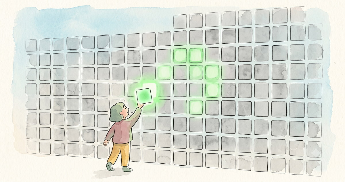
Think about a financial report with no charts. The numbers are all there, complete and accurate, but without visual structure most readers cannot interpret them quickly enough to act. The same thing happens to skills data. Organisations invest time mapping employee skills, only to end up with spreadsheets and databases that sit untouched because the data is too dense, too flat, and too disconnected from the decisions people need to make.
This is the core problem that data visualisation solves in skills management. It is not a cosmetic feature — it is what separates a skills matrix that gets used from one that doesn't. According to PwC, companies using data and analytics are three times more likely to see improvements in strategic decision-making than those that do not. The gap between collecting skills data and acting on it is, in large part, a visualisation problem.
A modern skills matrix addresses this directly. Where the traditional spreadsheet-based approach captures skills as static rows and columns that require manual interpretation, a software-based skills management platform presents the same data visually — making patterns, gaps, and opportunities immediately visible to managers, HR leaders, and employees alike. For a detailed look at how modern skills matrices differ from traditional ones, see the skills matrix 2026 guide.
What makes visualisation the critical layer in skills management
The modern skills matrix has two important features that provide organisations with immense value compared to its predecessor. First, it is more accessible — easier to create, easier to update, and open to both employees and the organisation rather than locked inside HR. This accessibility ensures it captures good quality, structured, real-time skills data.
But it is the second feature — visual presentation of that data — that multiplies the value of everything else. Without it, even well-maintained skills data remains inert. With it, a manager can see at a glance which skills are concentrated in one team and absent in another, which employees are ready for a new challenge, and where a single departure would leave the organisation exposed. The data does not just exist — it communicates.
This is the philosophy at the core of MuchSkills, influenced by the data visualisation work of Swedish physician and public speaker Hans Rosling, who argued that data must be communicated in an easily accessible way so that all of us — not just the experts — can understand it effortlessly, spot patterns, and make informed decisions. To understand more about why this matters, read The beauty of data visualisation.
“Better people analytics – and better ways of visualizing and interacting with that data – will not only help managers and recruiters do a better job of matching people with jobs but will also help each of us develop a more accurate picture of our strengths and weaknesses. We’ll be able to send clearer signals to the market about all that we can do.” -Michelle Weise in the Harvard Business Review
How MuchSkills visualises skills data
MuchSkills is a visual skills management platform built around the principle that skills data is only valuable when it can be understood and acted on quickly. Here is how that plays out across four core use cases.
1. Skill mapping: A live, visual picture of who can do what

MuchSkills provides a user-friendly, interactive interface that makes it easy for employees to keep their skills profiles current as their capabilities evolve. Skills are mapped from both perspectives: employees record their strengths, competency levels, and interest in using specific skills, while organisations map the skills critical to the business — including mandatory requirements, skill descriptions, and certifications.
A visually rendered organisational chart allows new and existing employees to quickly understand who their colleagues are, what they are good at, and how the organisation is structured as a network of people working together. This is what skill mapping looks like when it moves beyond a spreadsheet.
2. Skills analysis and reports: Spot gaps and opportunities across teams and the organisation

MuchSkills provides visualised skills overviews that can be filtered by organisation, department, location, office, team, or individual skill. These reports allow leaders to monitor critical skills across the organisation, search for a particular capability, or understand how skills are distributed by headcount.
The skills gap analysis built into MuchSkills makes it possible to identify where capability is missing, where it is over-concentrated in a small number of people, and where learning and development investment would have the greatest impact. Decisions on hiring, upskilling, and team composition can be grounded in data rather than assumption. For guidance on getting the most from this data, see skills matrix best practices.
3. Employee growth: From skills data to development plans

Organisations can define the skills required for specific roles, and employees receive personalised skills reports showing exactly where they stand relative to those requirements. This gives employees a clear picture of the skills they need to develop for their current role or a future one, and allows them to set skills-based goals and growth plans in collaboration with their managers.
Managers can track each employee's development over time, comment on progress, and use the same visual data to inform conversations about performance and career direction. The result is a development process that is transparent, specific, and grounded in the same skills data the organisation uses for planning.
4. Skills-based teams: Build teams by capability, not assumption

MuchSkills allows leaders to build project teams based entirely on skills — removing personal bias from the staffing process. Set the skills required for a project and receive recommendations of individuals with those capabilities from across the organisation. As the team is assembled, the platform displays the competency levels across each required skill, making it easy to ensure the right balance of expertise and experience.
Team overview pages can be shared with clients and stakeholders, displaying team composition, required skills, and existing capabilities. For consulting and professional services organisations in particular, this is a capability that directly connects skills visibility to client-facing performance.
Why visualisation drives engagement, not just efficiency
A visual skills matrix does not only benefit the organisation. When employees can see their own skills profile clearly — what they are strong in, what they are developing, and how they compare to the requirements for roles they want — they engage with the platform actively rather than treating it as an HR obligation.
As Michelle Weise noted in the Harvard Business Review: better ways of visualising people's skills will help each of us develop a more accurate picture of our strengths and weaknesses — and send clearer signals about all we can do. That insight applies as much to the individual employee using MuchSkills to plan their next step as it does to the HR leader using it to plan a workforce strategy.
Frequently asked questions
Why is data visualisation important for skills management?
Skills data collected in spreadsheets or static databases requires manual interpretation to be useful — and in practice, it rarely gets interpreted at all. Visualisation transforms that data into patterns, gaps, and insights that managers, HR leaders, and employees can understand and act on immediately. Without it, even accurate skills data tends to sit unused.
What does a visual skills matrix look like?
A visual skills matrix presents employee skills, proficiency levels, and competency gaps in a graphical format — typically through colour-coded matrices, interactive org charts, filterable dashboards, and individual skills profiles. Rather than reading rows and columns, users can scan, filter, and explore the data to find what they need quickly.
What is the difference between a spreadsheet skills matrix and skills matrix software?
A spreadsheet skills matrix is static, manually updated, and typically accessible only to HR. Skills matrix software is continuously updated through employee and manager input, visually presented, accessible across the organisation, and connected to reporting, gap analysis, and development planning tools. The data captured may be similar; the ability to act on it is fundamentally different.
How does MuchSkills visualise skills data?
MuchSkills presents skills data through four core visual tools: skill mapping profiles for individuals and teams, skills analysis reports filterable by department, location, or skill, personalised employee growth dashboards, and skills-based team builders that match people to projects by capability. All views update continuously as employees and managers keep skills data current.
Conclusion
A skills matrix without visualisation is a filing cabinet. The information is there, but finding it, interpreting it, and acting on it requires effort most people will not make consistently. Visual skills management changes that — not by adding complexity, but by making the data accessible enough that people actually use it.
If you are ready to see what a visual skills matrix looks like in practice, explore MuchSkills or start a free trial.

Subscribe to our newsletter